Web Accessibility
The Flip Side of the Coin
One view of Web accessibility is that it’s about making Web sites accessible to the disabled. Those with a bit more finesse in their understanding may reword that to making Web sites more accessible to “people with disabilities”.
In either case, though, it creates a duality: on the one hand, there are those who are not disabled, for whom any Web site will (at least theoretically) work just fine, while on the other, there are people with disabilities, who require some kind of special concessions to be able to use the Web.
The problem with that whole supposition is that disability is gone today and here tomorrow: our “abilities” may be fleeting, sporadic, temporary, and erratic.
Who Has Disabilities?
I don’t count myself as a person with a disability, and I’d guess many of the readers of About This Particular Macintosh would feel the same way about themselves.
Yet I’ve been wearing lenses to correct my vision for the last 40 years: I’m near-sighted. Without my glasses I wouldn’t have a hope of reading these words on my computer screen as I type them.
Nearly everyone I know wears glasses or contact lenses. I can’t think of any of them who would describe themselves as a person with a disability.
More Pixels, More Problems
About a year ago, I switched from using a PowerBook to using a MacBook Pro. The screen on the new machine is pretty much the same size as that on the old machine, but it crams in more pixels. Photos are gorgeous, but the first thing I noticed was that I couldn’t read anything! I had to go into the settings on every piece of software and enlarge the standard font size.
I bought the new machine at a time when I was working very hard and intensively, with long hours of looking at the screen. I soon realised that the increased font size was helping, but in the early morning and late at night, when my eyes were tired, I still couldn’t see well. For some portions of some days I needed to increase the font size or zoom level even further.
Is Middle Age a Disability?
Last week I turned 52. After about the age of 40 most people start to find their eyes aren’t as quick to focus; they’re not so instantly adaptable. It shows up as needing to hold a bottle farther away to read the small print on the label, bumping up the font size to read an e-mail, or having trouble with pale type on a textured background on a Web page.
Last night I started reading a new paperback book. I just about stopped before reading a word as it seemed to have been printed in 5-point type! Well, OK, maybe it’s actually 10- or 11-point type, but I can tell you that it’s darned small. I don’t need those large-print books you find on the special shelves in the library, just a more accessible size, or a friendlier, more open and distinct font face.
Dead Trees vs. the Living Screen
Of course, the problem with a book is that some designer somewhere has chosen a font face and size that will serve the printed book well. Perhaps it fits more words on a page, so the publisher can save a few dollars in printing and shipping costs. Perhaps the designer was a keen-eyed person who thought this particular font somehow reflected the tone and content of the book.
Once it’s on paper, though, it’s fixed: small print is and remains small print.
If only I were reading that book on a screen (ideally an electronic book—small, light and easy to hold, with storage for hundreds of books, a wireless interface for finding and downloading similar books, or works by the same author, for looking up a dictionary or translating a word) with a simple and instant method for changing font family, font size, contrast.
Software bestows flexibility: the reader can zoom, change fonts and font sizes, make a screen darker or brighter, even have the text read aloud.
Just How I Like It
Which brings us back to Web sites. While a book is black and white, static, the result of decisions made long ago, a Web site can and should be a dynamic, living thing. Users with tired eyes, or a painful mousing wrist, or who have trouble with language have the whole power of the computer and the Web at their disposal to assist them. They can interact with a Web site and adapt it to meet their needs.
A well-designed Web site will assist them in that adaptation. A Web site churned out with poorly researched software by a user with no understanding of good practice will hinder it.
So, What Can We Mac Users Do?
Fancy adapting someone else’s site to your own needs? Here’s what your modern Mac can do (some actions may require the latest operating system, a certain model of Mac, or certain functions to be activated). Another article in this series will look specifically at what your browser software can do.
System Preference: Displays
Choose System Preferences ‣ Displays and change the resolution of your screen. If it’s normally 1024×768, for example, and you choose 800×600 then everything on screen will appear to get bigger (and possibly fuzzier), including text.
Personally, I hate this solution. I want to make use of every pixel I have as it increases overall definition and crispness. It also allows me to have various windows open side-by-side, or at least overlapping, with each showing useful amounts of information.
This suggestion has gone down well though with some clients, who were having problems in general with reading text on screen, not just on Web pages.
Black, White, and Gray
Now things start to get really interesting! Select System Preferences ‣ Universal Access ‣ Seeing, and experiment with the Display controls. White on Black, Grayscale, and Enhanced Contrast all have a huge effect on how the screen appears. All the settings provide useful functionality for certain users.
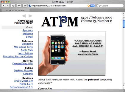
The ATPM Web site as it normally appears on my screen. At my normal screen resolution of 1440×900 my chosen browser window size fills about a quarter of my screen. At 800×600 it fills the entire screen. In these screenshots you may notice a button labelled 1P. It belongs to a utility called 1Password that makes it easy to fill in forms.
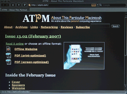
White on black: wow! Some people find it easier to read white text on a black background.
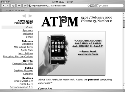
Grayscale takes out the colors. Some people surf Web sites with devices that use a grayscale screen. They find it tough to fill in a form when a site says something like: “Compulsory fields are marked in red.”
Instant Zoom
Zoom can give instant relief for the tiny print you sometimes find on a Web site. Turn it on and then zoom in on part of a Web page. Text and images are both zoomed.
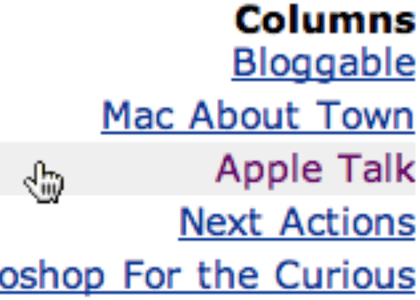
I zoomed in to take this screenshot. This screenshot captures the same area of the screen as the first three, but you can see that it is filled by just a few items from the Web page menu.
Adventures With VoiceOver
VoiceOver is a real live screenreader. Note that it’s seen considerable improvements as the operating system has developed. To use it, you’ll need to be running Mac OS X 10.4 or later.
A screenreader is handy for some people, and an absolute necessity for others. If you’ve never tried one out before then you’re in for a real education. It reads out what’s on screen, can tell you where your cursor is, what’s under the mouse, what you’re typing—in fact, everything you need to know to operate your Mac with your eyes closed (or without a monitor).
Sidenote: if you also have one hand tied behind your back, then be sure to visit the System Preferences ‣ Universal Access ‣ Keyboard. That’s where you can set preferences to allow you to operate a keyboard with one hand only.
In System Preferences ‣ Universal Access ‣ Seeing, turn on VoiceOver, then click to Open VoiceOver Utility. Visit each tab of VoiceOver Utility to see just what settings you can turn on and off. Try making VoiceOver very verbose, then visit the VoiceOver help menu to find out how to navigate and work with a Web page.
Tip: use the Help Index and choose the Web sites topic.
Link Lists
For example, with pretty well everything turned on in the VoiceOver Utility, I opened Safari and visited http://www.cricketchiangmai.com. I have no connection with the site, and in fact have never visited it before; I found it through a Google search.
After the page had loaded, I typed Control-Option–Down Arrow until the highlight moved to the page content. Note: in working with VoiceOver while writing this article, I found that sometimes I needed to move the highlight, while other times it seemed to already be in the page.
Then I typed Control-Option-U. A special VoiceOver Link Chooser window appeared, containing a list of all links on the page. Quite often when using Web sites we land on some kind of intro page and know we need to click a link to locate specific information (imagine visiting the Apple home page to find information about an iPod). Calling up a list of only links speeds this process, allowing us to avoid all the “blurb” on the page.
Using the down arrow I browsed the links, pressed Enter to select, then Control-Option-Space to activate one.
This 2.4 MB movie shows me briefly using the above Cricket site, using VoiceOver to call up a list of links, follow one, call up, and scan another list of links.
Who Fudged My Link?
The brief movie I made of my quick visit to the cricket site shows a couple of accessibility problems right away: several links leading to different content all use the same, meaningless, text: “Read more.” The Link Chooser takes those links out of their written context, where they followed an initial paragraph of explanation. Listed here, on their own, they convey no useful information.
Another problem is the use of initials. I have no idea what CMSCA means, nor can I guess.
A third major problem is that none of the major images use alternate text. In my Link Chooser they show up as image 1, image 2, and so on. If they had alternate text then that would be displayed in the Link Chooser.
VoiceOver has many settings and preferences, and many possibilities in its use. As a powerful application in its own right there is no way I can do it justice in a couple of paragraphs within one article, but my point has been made: software allows us to interact in diverse ways with a Web site. If the site is well-made then our interaction should be successful, but if it doesn’t embrace even very simple accessibility techniques, such as alternate text for images, then it can create needless barriers.
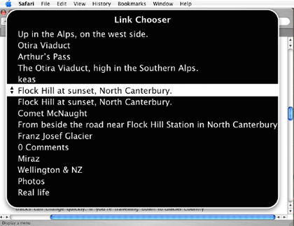
Most of the Links in this Link Chooser list are images. The alternate text is displayed.
It’s All Mutable
This article began by pointing out that a distinction between “the able” and “the disabled” is artificial: we live in a world where people’s abilities vary in many dimensions and across time. I may have perfect vision, or corrected almost-perfect vision one day, tired eyes or broken glasses the next. My computer screen may have low or high resolution. It may be in a dark room, or under the glare of the sun. I may be too busy to watch the screen and choose to have the computer read the screen aloud to me. I may be legally blind and not look at a screen at all.
A broken wrist may make typing tricky, or I may be unable to move my limbs because of paralysis.
VoiceOver and the other System Preferences mentioned are examples of how a computer can interact with a Web site and make it look very different from how the site’s creator had imagined. In articles to come I’ll look at how we can use Web browser software to shape a Web site to our own needs or wishes.
Also in This Series
- What Browsers Can Do, Part 2 · May 2007
- What Browsers Can Do · April 2007
- The Flip Side of the Coin · March 2007
- SeaMonkey 1.0.6 · December 2006
- PageSpinner 4.6.3: Quirky and Erratic · November 2006
- Nvu: Impressive and Powerful · October 2006
- RapidWeaver: A Useful Tool in Need of Sharpening · September 2006
- Sandvox: Sand in the Eyes · August 2006
- The Clayton’s Web · July 2006
- Complete Archive
Reader Comments (4)
Robert
Zoshe Foundation
www.zoshe.com
I'm typing this on a 20" LCD running at 1,680×1,050 and while it's fairly comfortable, I must admit that I would prefer the same resolution on a 21". I am in the minority. Most people I know, even (especially?) tech-savvy users, would prefer to bump up the resolution, even if the display were smaller, so that they'd be running 1,920×1,200 on a 19", or something similar.
I would say that these are forms of disabilities and that websites should take them in mind when designing....
I know personally I have to enlarge the text on almost every website (did not have to for this site though)
Regards,
Jan Fuellemann
Add A Comment