Quick Tips in Design
Part 8: Pattern
Pattern is a repeating visual element that can be created by duplicating size, shape, position, symmetry, frequency, value, and color. Patterns are usually stronger when combining two or more repeating elements. Most often, people associate size, shape, and position of visual objects with pattern, but value and color are also strong pattern tools.

Pattern in visual arts is used for building larger objects, decoration, organization, association with other patterned objects, and meaning.
When a unit is used for building a larger object, patterns are created. When the shape of the units is similar, the pattern becomes more pronounced. Media such as textiles, ceramics, jewelry, and masonry use repeated smaller elements for the construction of a larger work. Because of their methods of fabrication, these media are naturally suited for the creation of decorative patterns.

Pattern can be used to allude to these media, or it can borrow from them to suggest less direct associations. A pattern similar to one seen on a woven silk damask may suggest wealth, expense, quality, and conservatism, significantly more than just an association with fabric. Using pattern in design to create associations with patterns in the real world is a simple and effective method of pattern application.

Patterns have cultural, religious, and philosophical significance. Many patterns have traditional meanings that symbolize the place of mankind in relation to nature and the universe. While this symbolism can be found in patterns from most cultures, it is very prominent in Islamic art and architecture where pattern is used for the philosophical discussion between humans and God.

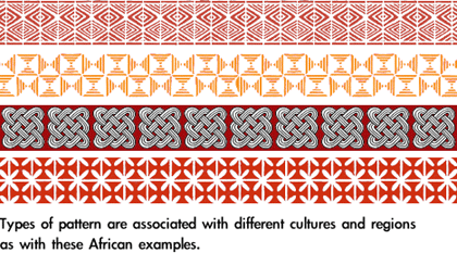
Natural icons are common in cultural patterns, especially animals (both real and mythical), flowers, and foliage. Common objects and especially woven objects, such as rope, textiles, and baskets, also become the inspiration for patterned decorative cultural imagery.
Many cultures share patterns, even such “unrelated” cultures as Native Americans and aboriginal Australians which were physically separated from European, Asian, and African cultural influences for millennia. In some cases the only major differences to the casual observer among these cultural patterns is the color usage. Color in pattern can be extremely important in dictating cultural meanings.
There are many excellent and specific books available about cultural patterns, most offering usable examples. A search on the Web for “Celtic pattern”—or any other culture/region—will usually return a myriad of books containing thousands of patterns, for a good desk reference for anyone using pattern in design.

The Golden Mean (Phi)
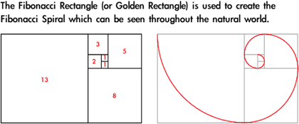
The Fibonacci sequence is a series of numbers which appear throughout nature. This sequence can be used to calculate the golden mean (or the golden section) which is represented by the Greek letter Phi. The Fibonacci sequence and Phi can be found visually in plants and seashells, and in the reproductive family trees of animals.

The sequence starts out: 0, 1, 1, 2, 3, 5, 8, 13, 21, 34, and continues ad infinitum. Each new number in the sequence is created by adding the previous two numbers. For example, the sum of 8 + 13 is 21, making 21 the next number after 13.
Phi, also known as the golden mean, is the ratio between two sequential numbers in the Fibonacci sequence. When 1597 is divided by 987 the result is 1.618034447821682, which rounds to 1.618. The higher the numbers used to create the ratio, the more exact the calculation becomes.

Further study about the patterned relationships among mathematics, nature, music, and visual art can be found in Gödel, Escher, Bach: An Eternal Golden Braid by Douglas R. Hofstadter.
Self-similarity
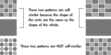
There is a special kind of pattern that is self-similar, meaning the building unit contained in the pattern is the same as the overall completed shape. Cultural patterns often use self-similarity to suggest infinity and visually express other philosophical and existential concepts.


Fractals
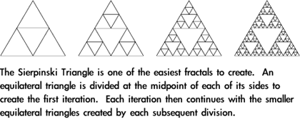
A fractal is a shape that is self-similar and has a fractional dimension. Self-similarity is a required element in fractals, but all self-similar shapes are not fractals. With fractals, an infinite number of self-similar shapes can be found inside a larger shape, or the shape used as the pattern’s building unit can be “grown” into infinite detail by using itself as the blueprint. Each of these stages with smaller divisions is called an iteration.


Applying Pattern
Pattern is an extremely powerful method to focus viewer attention. The repetition easily seen in most patterns uses all of the Gestalt principles discussed in previous articles. For that reason, pattern is often used in design as a tool for organization, especially when used with text. Common methods for pattern-based organization include:
- Bullets and other shapes to list, outline, and highlight
- Alternating row colors to make individual items stand out, yet still be part of a whole
- Grid-based layout where similar shapes create a common theme, even if the content within the shapes is dissimilar (for example, different photos that are all cropped to the same size and shape and arranged in a grid pattern)
- Color-coding
Because of the power of pattern as a visual element, it is important to use it for desired effect. A pattern can unintentionally destroy the intended message of a visual work by competing with other elements. Even if a pattern is decorative it still must be considered as part of the whole composition as with other complex shapes.
Tiled backgrounds can become distracting and make the other content more difficult to follow because the viewer is naturally drawn to the repetition of the pattern.
Patterns that use grids face another problem. An optical illusion can be created by high contrast areas. This is due to the way the human retina works, and the only true method for avoiding this problem is to change the pattern itself.

Moiré patterns occur when patterns of different frequencies are used together. This can be easily observed when halftoned images are reproduced using another patterned technology. For example, the halftone printed images from a magazine are already arranged in a pattern that is a different frequency from the pixels created by a scanner and the pixels displayed on a computer monitor. Moiré patterns are also created when striped or checkered patterns appear on video. A solution that sometimes works for scanning is to scan at the highest quality possible and drastically reduce the size using photo software. Applying a Gaussian blur to the image before it is reduced sometimes helps as well, but there is no exact method because each image is different and may be printed at a different halftone screen frequency.
The solution for Moiré patterns in video is simple: don’t wear fine stripes or fine checkered patterns when you’re going to appear on television.
• • •
Use of pattern can add interest as well as visual information to your project. Patterns can be used to enhance many purely figurative designs, as well as decoratively to complement text. Pattern is a strong visual tool that should not be overlooked.
Also in This Series
- Part 8: Pattern · February 2004
- Part 7: Type as Shape · January 2004
- Part 6: Color Science · December 2003
- Part 5: Shape · November 2003
- Part 4: Line · October 2003
- Part 3: The Illusion of Depth · September 2003
- Part 2: Using Color · August 2003
- Part 1: Using Value · July 2003
- Complete Archive
Reader Comments (10)
I create PowerPoint presentations for my managers, although I am still in the beginning stages of this kind of work. However, I am trying to find creative ways to create presentations that veer away from the standard templates that are overused by everyone else. Your articles have inspired me to experiment with various color schemes and designs so I can do more than just project white lettering on a dark blue background.
I look forward to reading your future "Quick Tips in Design" columns. Thanks again.
Brian H.
California, USA
Thankyou!
Kudos!
Everlyn,
Nairobi, Kenya
Add A Comment