Quick Tips in Design
Part 4: Line
Line is one of the oldest and most fundamental tools in the visual arts. The use of line is found in cave paintings and rock carvings dating back well over 20,000 years, making it one of the most ancient documented artistic techniques.
In geometry, a line is described as the shortest distance between two points, but that only describes a straight line when talking about visual art. In art and design, the definition of line is not so limiting. The aesthetic definition of line is the visual connection of two points. A stroke is one continuous mark. Line can be made up of many different strokes, with even or varying thickness in the same stroke.
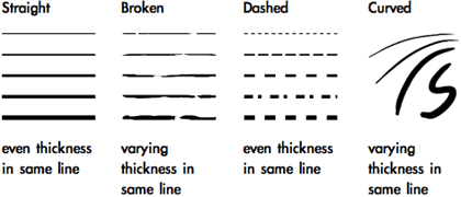
When using natural media or a computer drawing tablet, line can be changed by the tightness of grip, position of the fingers, position of the wrist and arm, pressure, and speed of the stroke.
Contour with line is the outline of a shape or object. A contour drawing is only made up of outlines, and depending on the application the drawing may be composed of one unbroken line to create the entire image.
The quality of line has many applications, depending on the desired reactions from the viewer.

Technical drawings use thin lines of equal width, because even line is less distracting and allows the viewer to focus on the content of the drawing. Thin even lines also give a more precise point for measurements, allowing technical drawings to be used as blueprints for construction. Delicate, broken, tenuous line can suggest nervousness.

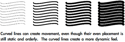
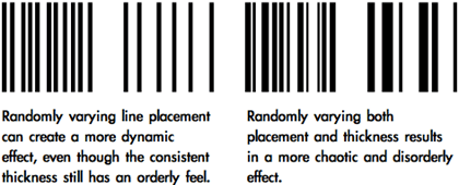
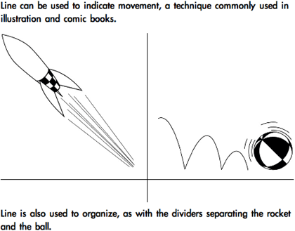
Line is also used to abstractly describe the separation between areas of change, when objects are aligned, or when the repetition of objects creates “line” and visual movement. Instead of being a mark between two points, line is used to describe a visual connection.
Gestalt Theory
An easy way to understand Gestalt Theory is by imagining that we are baking a cake. The ingredients for the cake are arranged on a counter, but individual ingredients cannot begin to describe the cake. For example, an egg might be a cake ingredient. If we examine the egg, it tells us about the egg, but not how it will be used to create a cake. It is only when assembled that the ingredients form the completed product. The whole cannot be seen by looking only at the individual elements.
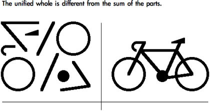
Gestalt Theory is a set of rules for describing how the various ingredients of visual art come together to form the whole. Gestalt is the German word for “form, shape, pattern, or configuration.” “Good gestalt” is when elements work together to create a unified aesthetic. Gestalt Theory helps explain many of the abstract principles used in the visual arts.
Gestalt: Proximity
Proximity is the first Gestalt principle discussed because it relates directly to line. The Gestalt Law of Proximity states that elements that are closer together will be seen as a coherent object. As objects become closer they are seen as more unified. Proximity explains why broken or dashed lines and separate shapes can be interpreted as line.
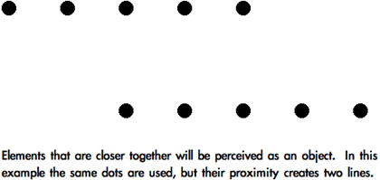

Gestalt: Continuity
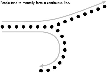
People tend to interpret line and contours whenever the visual elements of an image establish a direction. This explains “movement” in an image, since the eye continues in the direction that has been established. The viewer follows a larger uninterrupted form composed of smaller separate forms.
Value With Line
Changing line frequency and thickness are the most fundamental techniques to suggest value using line. Interpretation of line as value is an application of both Proximity and Similarity Gestalt principles. Line frequency and thickness can be used separately, or together for a more natural effect.
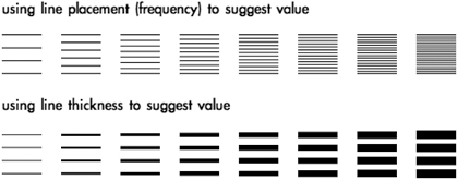
Hatching is the technique of using parallel lines to create value. Feathering is a variation of hatching in which the thickness and placement of the lines change to create value gradations.

The direction of line can also be changed. When sets of parallel lines are used together crossing in different directions, the technique is called cross-hatching. Feathering can also be used in cross-hatching.
Varying frequency, line thickness, direction, and stroke length within the same image can create a sketchier quality with richer depth of tone.

More about value and its uses can be found in Part 1: Using Value.
The next article will discuss shape (simple, complex, geometric, natural, and abstract) and more Gestalt Theory.
Also in This Series
- Part 8: Pattern · February 2004
- Part 7: Type as Shape · January 2004
- Part 6: Color Science · December 2003
- Part 5: Shape · November 2003
- Part 4: Line · October 2003
- Part 3: The Illusion of Depth · September 2003
- Part 2: Using Color · August 2003
- Part 1: Using Value · July 2003
- Complete Archive
Reader Comments (8)
Keep up the good work!
Bongani,South Afica.
Add A Comment