About This Particular Outliner
NoteTaker and NoteBook
This month we take a look at AquaMinds NoteTaker and Circus Ponies NoteBook. I have gotten more mail requesting a look at these two than any subject other than the legacy outliners.

NoteBook and NoteTaker Icons
Both of these give their own joy depending on how your mind is sculpted. I can recommend either. Both push the user interface and feature envelope into new territory in slightly different ways, and they compete against each other. Both are on a fast track development-wise and would be good candidates for partners for the future, but they are different enough in their underlying philosophies that they will find distinctly different user bases.
I admit that I got into the business of writing ATPO precisely because I was confronted with these two applications. I am a heavy outliner and use several programs intensively. Moving part of my life into an application is a heavy commitment, and I was already in love elsewhere. I had to upgrade, but to which app? And for what use?
This forced me into a period of introspection about outlining possibilities and tools, the results of which grew into ATPO. The idea is that your typical Mac user has a clever imagination that wants to spin up great stuff. How that imagination moves is largely dependent on the tools used and—most importantly—the philosophy behind them.
These two tools, NoteBook and NoteTaker, superficially look like twins. They both present as multipage spiral notebooks with cover, table of contents, section dividers with section contents and tabs, “regular” pages, and several types of index pages at the back. Both have stamps/marks, text highlighters, labels, and support multimedia and advanced clipping. There are other superficial similarities as well.
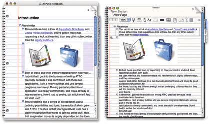
NoteBook and NoteTaker With Default Settings
The things that attracted me were that they are Cocoa applications that promiscuously exploit the strengths of the modern Mac; their multipurpose functionality meant that either could serve as someone’s only outliner; and (big fanfare here) they both have a feature that no other outliner has: multilevel outlines. Multilevel outlines are outlines of outlines. These notebooks literally have outlines of the pages that contain outlines, potentially powerful stuff. We discussed this feature in some detail in October.
Common Heritage, Different Philosophies
A particular background is always mentioned in this context: once upon a time there was a much admired NeXT notebook outliner called “NoteBook,” from Millennium Software. At some point, the two principals left and started their own companies, those we see here. Jayson Adams is the man behind Circus Ponies NoteBook; Scott Love heads AquaMinds and NoteTaker.
Both seem to have kept the rights to the original NoteBook code and certainly some NeXT code has been brought forward, but I suspect it to be a small portion in each case.
Most prospective users might think this indicates that the products are as similar as they initially appear. But consider that these two developers quarrelled severely enough to get a divorce. Presumably they differed on fundamental aspects of the notebook and the philosophies behind it. I think this is the case, because under the similar skins are two different religions.
User opinion seems to have established that NoteTaker has more frequent updates and more features, while NoteBook takes more care to be elegant and complete in executing features. That wisdom also holds that while NoteTaker’s features always work, they sometimes seem comparatively slapdash and carry minor glitches such as redraw problems until the next update. In my experience, this was the case early in the game, but NoteBook’s feature set is now in the same ballpark and NoteTaker’s unpolished quirks seem to have abated.
Another difference: Circus Ponies has pretty dreadful documentation (no index or search!) but a great, friendly support forum that involves the developers: feedback is direct and honest and suggestions and bugs are dealt with speedily. On the other hand, AquaMinds has a flood of complete, impressive, and effective documentation, videos (for $80) and tutorials, but no public support forum at all!
Incidentally, I find it absolutely goofy that outliners in general do not deliver their documentation in their own format. It is doubly strange with these two that have so much to offer.
I do not intend to give a complete review here; those tend to be death marches of feature counting and list comparison. (But check out my first official review—of a non-outliner application—elsewhere in this edition of ATPM.) Instead, we’ll focus on the outlining functions of these multipurpose applications and try to dig deeply enough into their philosophies to help you see if one can be Your Particular Outliner.
Outlining Features
These are applications that bust software categories, though outliners have been doing that for some time. They are outliners in the sense of being ready repositories for collecting thoughts and items related to them, then slowly adding order according to your work style. This outlining function is our focus in this column.
But they also function as high level clipping services, scrapbooks, and freeform databases. They even could be seen as a new form of Web site development tool. Each of these functions supports the outlining which we’ll assume is the core you are looking for, though it need not be so.
Outlining on a Page
In one sense, these outliners are an elegant implementation of tabbed windows instead of the multiple windows that typified the original Mac interface. Each “page” in the notebook is an outline, so if we are looking at core outlining competence, we need to start here.
Both of these notebooks rashly chose a shiny jellybean widget metaphor when Apple was into lickability. NoteBook uses an inflated glossy equilateral triangle. It employs a not widely used triangle convention that has “collapsed” arrows pointed right and “uncollapsed” arrows pointing down. I think this is a big mistake because headers with nothing under them at all (even text intended to be note paragraphs) have the same indicator as those that say “look below for content.” This is the same goof that the Mac Finder makes, by the way.
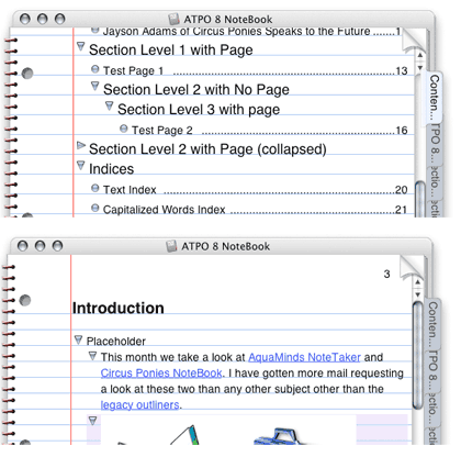
NoteBook Widgets
Fortunately, Circus Ponies has added an option to change the widgets to the ordinary grey ones we know. We’ll show those in the NoteBook screenshots that follow. There is a separate option to eliminates any arrow for a cell with no subcell. Together, these are much nicer.
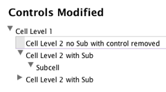
Familiar NoteBook Widgets
NoteTaker on the other hand has taken a wholly different tack. It uses the Aqua-fied “plus-labels” we described in a previous column that originated in the command-line world and was brought to the Mac by MORE. (Scott Love worked on MORE.) No other modern outliner in the Mac world uses these plus and minus labels, but they are common in the Windows world. NoteTaker has announced their intentions to enter the Windows market, and this choice may reflect that strategy.
On the other hand, you can quickly get used to it. It has the purity of a functional logic (plus for collapsed cells, minus for uncollapsed and no character for a cell with no subcells). Also, it looks nice and consistent, at least on the outliner pages. The “section” pages are a different story, but again you can switch to the familiar Mac arrows if you wish. When doing this, NoteTaker uses a dot for a cell with no children, like OmniOutliner does. We’ll make the switch in NoteTaker in what follows. Why use Windows conventions when these Mac ones are so much better?
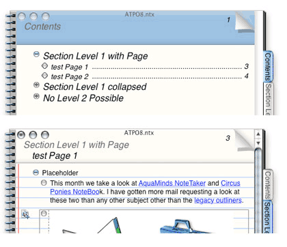
NoteTaker Widgets
Already we encounter some of the larger differences between these two outliners. NoteBook has been working hard to court MORE-type users and has implemented every applicable key command and operation from that venerable outliner. Some of these are quite esoteric but very handy for power outliners. They’ve given options so that arcane but useful MORE behavior is used. For instance, NoteBook has an option such that if a cell has children and you hit Return, you enter a child at the top of the stack. These little things are great if you are deep into using your outliner as a writing tool.
Both have a more elegant drag indicator than any other outliner. As you drag the cells to their new location, an outline appears where the drop would occur with everything below moved out of the way. NoteBook goes a little further in that their drop box reflects the indented structure of the dragged cells.
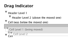
NoteBook Drag Indicator
Both have an elegant hoist feature, and they both use the same hoist indicator, a dash with three dots. But look how differently they are placed.
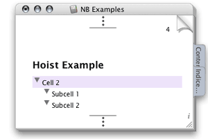
NoteBook Hoist Indicator
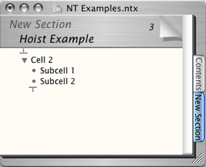
NoteTaker “Focus” Indicator
Neither notebook allows you to place cells just anywhere on the page like Curio (whose pages are not outline pages) or OneNote for Windows (whose notebook pages can contain outlines).
Neither of these supports clones, a prerequisite of a power outliner. And neither supports columns.
Outlines of Outlines
The huge advantage that both of these have over all other outliners is the outlines of outlines feature. The notebooks are set up so that they have an overall contents page of everything in the notebook. This is an outline as well. But it has some subtle differences from page outlines.
Below is a typical NoteBook contents page. (I have put a tiled image on it and changed the outline widgets to make it look nicer.) You’ll note that there are two types of headers, pages (which have page numbers) and section headers. Subsection headers are called “dividers” but they behave just like section dividers and have tabs. Section dividers have tabs and a subset of the table of contents that applies to that section.
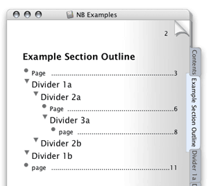
NoteBook Contents Page with Contents Outline
Taking the levels further down, in either notebook you can give any page a tab.
In NoteBook, all of the important outlining commands can be used here on these meta-outlines. Way cool. There’s more: this contents outline can hold pretty much any object the page outlines can, so you can literally have a page title that is a graphic. NoteTaker only allows text in its contents outline.
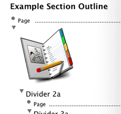
Partial NoteBook Contents Page with Graphic
Now we will see how NoteTaker handles this same problem: its solution is radically different. It doesn’t have the coolness of NoteBook’s outlining on contents pages. Instead it goes in a different, but still cool, direction. First of all, NoteTaker does not allow much of an outline on its contents pages. Only two levels are supported: pages and sections. Bummer.
But look at the screenshot below. NoteTaker squarely faces a key problem with the notebook metaphor: you can only see one page at a time. That means you can be looking at the contents outline or a page outline, but not both. NoteTaker has a drawer that displays the contents outline so that you can navigate to any page from any page. Objects in that outline can be double-clicked, but they cannot be rearranged. Shucks.
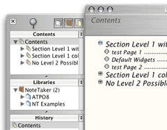
NoteTaker MetaOutline Drawer with Default Buttons
And look below in the same drawer and see yet a third level of outline—sort of! This (called the “library”) is a subset of the Finder view of available NoteTaker notebooks. Below that is a “history” list of visited pages.
This is a fabulous feature (configured by several options in the preferences). It helps with navigation. But it is pretty clumsy in appearance because it uses completely different outline widgets and commands than the default shiny plus-labels. Oh well, switch to the Mac labels to feel more comfortable.
Both NoteBook and NoteTaker take advantage of contextual menus in a great way. If you hover over a tab (usually on the right side of the notebook) and control-click, you get a list of the pages in that section—way cool navigation. The screenshot shows NoteBook’s implementation, which allows hierarchy. NoteTaker’s is similar except it doesn’t permit subdividers so just gives a flat list of pages.
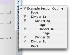
NoteBook Contextual Pop-up
So NoteTaker has three ways of page navigation (drawer, contents pages, tab contextual menu) and NoteBook has two which exploit outlines much more fully.
Now we come to my major heartbreak with both of these outliners. Outlining is about structuring and restructuring. They both have this neat idea of double outlines, but there is no way in either to go back and forth between outline levels without going around the barn. Suppose I discovered that I had a very large page; there is no way to promote a page to a section or the other way around: “demoting” a slender section to a page.
And it gets much, much worse for the outline user. Outline restructuring is primarily a matter of keyboard operations in four directions or dragging. Suppose you want to drag a group of cells from one page to another in the same notebook: you simply cannot do it. You cannot open multiple copies of the same notebook. And you cannot drag to a tab, have that tab open the desired page and then drop on that page. OmniOutliner, one of the competitors for serious outlining, can readily drag anything among “spatial” windows. This is where the idea of stacked windows as pages kicks you in the butt. Not even NoteTaker’s neat drawer can be dragged to.
No robust drag-and-drop functionality within a notebook is heartbreak city. But both of these outliners are improving at breakneck speed so perhaps this deficiency will be addressed soon (especially if you request it). NoteBook recently delivered the capability to drag items between notebooks and both allow dragging of pages and page groups.
What we need is springloaded tabs, but we haven’t got ’em. NoteBook can drag cells with siblings (but not groups of cells) to another page in the same notebook under certain conditions. The pages have to be of the same type (“section” or outline pages), the target page must have a tab, and the dropped cell goes at the bottom of the page. A workaround.
Integration of Multimedia and Web pages
We mentioned OmniOutliner, which can only handle text. Both NoteTaker and NoteBook do well with multimedia, NoteTaker on regular pages only. They can handle pretty much anything you can throw at them: nearly any image, movie, or PDF. Files can generally be embedded or referenced (in which case the file is not copied). We’ll deal with database issues surrounding multimedia below.
If you drag a media file, the content is copied into the notebook. If you Option-drag, the file contents are copied by reference like we had in OS 9’s Publish and Subscribe. This is true in both.
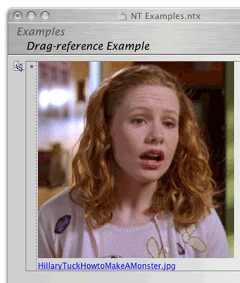
NoteTaker Image that Has Been Drag-Referenced
NoteBook allows for “media frames,” a collection of display options for media, including scaling, rotating and other attributes.
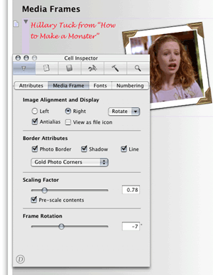
NoteBook Media Frames Options
NoteTaker can do some limited scaling through a contextual menu, but otherwise lacks the options of NoteBook. Instead, NoteTaker displays a hotlink to the file, and pressing Option while over the file displays the path, something they call “x-ray.”
Presumably you can already see what is obvious to me after a few months with these programs. NoteBook sees itself as a power outliner with database and other capabilities, while NoteTaker exists as a great freeform database with outlining and other capabilities. Those “other capabilities” are similar and in some cases identical, but the basic identities of these are fundamentally different. Every design decision we see where they differ can be explained this way.
Both notebooks allow voice annotation, something apparently important in a laboratory environment. I did not explore the relative merits of the implementations.
Both notebooks are extremely friendly to Web content. URLs display as links, and clipped or dragged Web content displays in a cell precisely as it does in a browser. NoteTaker offers a few more options in this regard, but neither seems to have done what Tinderbox has: allow automatically refreshed pages and RSS content. Neither supports wiki links, like Hog Bay Notebook.
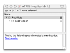
Hog Bay WikiLinks
NoteTaker has however incorporated Web services in such a way that one can make a cell a browser! Clicking a link in a Web page opens that page in the cell just as if it were Safari.
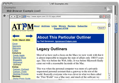
NoteTaker Cell as Web Browser
Integration into Workflow
Any serious outliner is going to wonder how this fits into the workflow. We’ll address the “goesinta” in another section below, as that is largely a clipping, scrapbooking, databasing sort of thing with its own competition like DEVONthink. Here, we’ll only mention that both notebooks are good citizens regarding import and export of OPML, a standard XML format for exchanging outlines. Hog Bay Notebook and OmniOutliner also support OPML, and DEVONthink support has been announced. Many users seem to combine several of these outliners in an OPML workflow.
The big question is what more robust options exist for designing workflows.
Both notebooks allow publishing to the Web. They do it by creating an HTML version of their notebook appearance and (most) functionality. You upload this to your Web site or local server and people can read your notebook pretty much as if it were in the host application on your machine. I’m told there are minor quirks with NoteTaker due to the goofy variety of browsers and “standards,” but I haven’t exhaustively tested this.
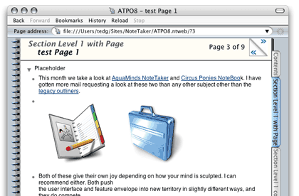
NoteTaker Web Outline Publishing
I have to say that doing it at least once is a pretty cool experience.
But what if you want to export to InDesign, or Word, or Dreamweaver?
NoteTaker imports and exports native Word format, though it exports awkwardly. Referenced content is lost, as is most formatting and all outline structure. By that I mean if you enter Word’s outliner, no structure will be there. As a worst-of-both-worlds situation, the indents are carried over to the layout view so that the appearance of an outline is displayed.
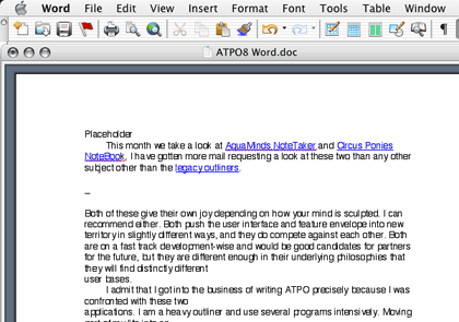
NoteTaker Content in Word
In NoteTaker’s defense, export to Word seems to be a heck of a challenge, even using Panther’s support for Word format. Inspiration has focused on just this capability for years and does only a little better.
AquaMinds exports to NTML (NoteTaker Markup Language) and NoteBook does NBML. Both are XML-based and are more robust than OPML. Once you have your outline in XML, you or another user can write translations to do pretty much anything. This is about as open as a format can get.
Meanwhile, both have options for tailoring their HTML output on a page-by-page basis so that you can produce a “normal” looking site automatically. And NoteTaker supplies a free “reader” so that you can distribute your notebooks as-is.
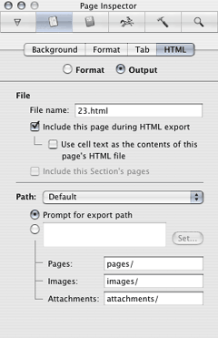
NoteBook HTML Export Options
For now, both notebooks export equally useful PDF, OPML, their own XML and RTF. Both have facilities of different types and robustness to excerpt parts of notebooks, and in NoteTaker’s case, to e-mail them.
Links
We’ve talked about URL links a little. What about links within the notebook and to other notebooks? NoteTaker has this well in hand. It is not as robust as Tinderbox’s many types of links—NoteTaker links are just like HTML links. But they can be two-way (very nice), and they can be from text or cell to text, cell, or page. They are designated by a badge to the left of a cell and—as with referenced Web and image content—Option-hovering reveals the source. NoteTaker links can be to other notebooks as well.
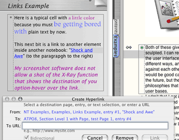
NoteTaker Links and X-ray Pop-up
NoteBook’s links can presently be only from text to a page within the current notebook.
See the pattern of NoteBook drifting to power outliner and NoteTaker to power freeform database?
Outline Formatting
I’ve discovered that one hot button among outliner people is their appreciation for sophisticated outline formats. They want control. They want visible structure. They want options.
Both notebooks allow you to change font styles individually. How could they not? Additionally, NoteTaker has a “Favorite Styles” submenu where you can name styles and apply them to selected text, but otherwise, NoteTaker considers all cells to be the same style regardless of placement in the outline.
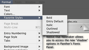
NoteTaker Favorite Styles Menu
NoteBook goes much further, at least as far as MORE and OmniOutliner in level-specific styles. You can specify styles for outline levels so that you can—for instance—specify that Level 2 is a little smaller or less bold (or red) than Level 1. NoteBook also has quite a few more options with label style. Labels are the numbers in parentheses or letters that many outliners use.
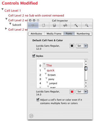
NoteBook Level Styles
Both allow all sorts of honking around with margins, images on background, removing the “binding,” three-punch holes and paper lines. You can color, remove, or relocate the tabs that are normally on the right. NoteBook considers its contents/section pages to be different animals so you can format those differently. I find that a great help in reminding me that the outline level has shifted.
Folding
Folding, in normal outlining usage, is the ability to collapse cells to only their first lines, independent of collapsing subcells up underneath. It is very handy when you want to get a big picture of the outline because no cell takes more than one line.
Both NoteBook and NoteTaker support the same method of folding, which is the sweetest I have ever seen. You can fold any text cell or collection or selected text cells by using a key command (Command-Esc for NoteTaker, Esc for NoteBook). They then fold to one line followed by an ellipsis.
The cool part is that once you enter a folded cell, it automatically expands it for editing. That’s an attention to detail that takes the breath away.
NoteTaker’s folding goes one better and is the only case where it beats NoteBook in the outlining area. That same key command when no cell is selected toggles what they call “multiline” mode so that all new cells are presumed to be folded.
Other Miscellaneous Outlining Stuff
NoteTaker lets you assign and change keystrokes for menu items, even the “favorite styles” you will certainly add. NoteTaker has all the outlining menu commands NoteBook does, I think, so you could emulate the MORE command set if you wish. NoteBook does not allow custom key assignments, and as I will remark later, many of its important controls are not in menus anyway, but in “inspectors.”
NoteBook has superior typographic controls, allowing for shifted baselines, ligatures, and kerning. Great, but these settings are not included in the custom styles for outline levels. Ouch!
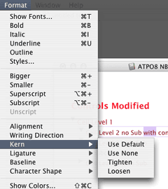
NoteBook Typographic Controls
I consider “finding” to be a basic outlining capability. NoteTaker has a minimal find/replace (find a text string, but you can search over many notebooks) while NoteBook’s “superfind” also considers assignable cell attributes (keywords, “stickers,” highlights, dates, and priorities) that will be mentioned below. The results of a “superfind” are presented as a page on the index. Results are displayed with surrounding context so you can actually understand them. Each result is hotlinked to its occurrence. Nice.
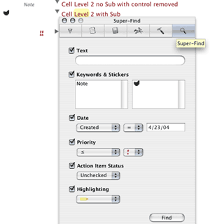
NoteBook Super-Find Panel
Incidentally, this “superfind” is close in effect to MORE’s much-celebrated “search, mark, and gather” feature.
Database Features
My job here is to focus on the outlining capabilities. As you’ve seen, both are worthy outliners but they also serve as freeform databases. For many outlining uses, the merger of these two capabilities is natural.
The idea behind a database is that there is “metadata” associated with an item. Here we see an even bigger difference in underlying philosophy.
NoteBook’s approach is the most straightforward. Metadata is handled as simple attributes. You can make up and assign keywords to cells. You can also apply “stickers,” which are the same type of thing, except little pictures. These are optionally displayed to the left of the cell. Priorities are a similar attribute.
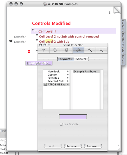
NoteBook Attributes
Each is collected into a group for organization. Once applied to a cell, the group assignment is lost. Cells also have invisible date attributes: date created and date modified.
You assign attributes to text blocks in NoteBook by “highlighting” via one of six colors. This text attribute may not seem like the other attributes until you realize that highlighted text is indexed and you can “superfind” using highlight as an attribute.
NoteBook automatically builds indexes of each of these plus all the words in the notebook (more of a concordance, really) and the “superfind” results already mentioned. There’s also a list of “attachments,” which is NoteBook’s term for referenced files, but none for internal links.
NoteTaker superficially seems identical. It similarly builds indexes of words, proper words, numbers, documents (identical to NoteBook’s “attachments”), date last changed, dates in cells, e-mail addresses, URLs, and “categories.” This seems the same except for a few details and that last thing, “category.” But that last item is radically different.
First a word about NoteTaker’s index display. It uses outline organization where it can, for instance all words starting with “A” would be collapsed under A. Next to an index entry is a number representing the page number(s) where that item—in this case a word—might be found. Clicking on that page number takes you to the page. Option-hovering on one of those numbers displays a window with the item in context. This “x-ray” feature is used elsewhere in NoteTaker.
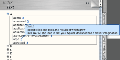
A NoteTaker Index
NoteBook takes a different approach. It does not use a collapsible outline format. The numbers next to the index entry are not the page numbers but the number of occurrences, for instance (1,2,3). A contextual menu will pop up to tell you the page title of that occurrence.
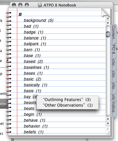
A NoteBook Index
NoteTaker Categories, Templates and “Summarize”
Now let’s dig into NoteTaker categories. These are not the “passive” descriptors of NoteBook. They can be; you can make up any group and category and use it just like NoteBook’s attributes, as tags. But NoteTaker also rolls its internal attributes into this list, stuff such as whether a cell is an image, link, movie or such. You cannot edit this group.
So far, NoteTaker “categories” are just like NoteBook’s collection of attributes (keywords and stickers and such) but less visually exploited on outline pages. So why am I excited? Because NoteTaker users can build “templates” with these categories.
A template is a group of cells with assigned categories and styles. Suppose you wanted to make a movie notebook and had a section where each movie had a page. You’d want some cells to be like fields in a database, with titles like: “Movie Name,” “Director,” and other text entries. But you would likely want a date cell as well, and some for images and video clips and URLs. Easy as pie to make such a template for a page.
ATPO readers may remember us enthusing about an identical capability with the long lost Arrange in our survey of legacy outliners. NoteTaker’s template cells allow you to attach style, formatting, and outline hierarchy information to template cells (as in Arrange). You can see that NoteTaker’s attention to styles is over on this database side rather than outlining.
Now remember that all categories are automatically indexed. Sweet, if you’ve set things up right.
NoteTaker has a cool feature called “highlight and summarize.” Basically it is a progressive find feature that searches for text, categories, priorities, date, and flag. You can page through found results, highlight them and/or create a “summary” which appears as an index. The result looks much like NoteBook’s “superfind,” but the underlying approach is quite different.
(Highlight in the NoteTaker context is not like NoteBook’s where you highlight a text block with different colors. Instead, you have one color that highlights the whole cell. “Highlight” and “flag” are ways of marking a cell.)
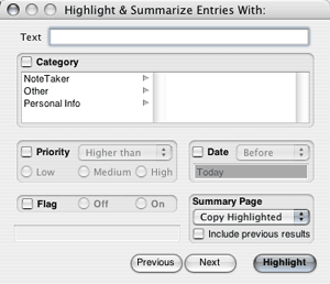
NoteTaker Highlight and Summarize Dialog
Neither NoteTaker’s nor NoteBook’s supersearch dialogs allow for patterns, Boolean searches (except in the text field), or relatives (find cells that have the priority “high” and modified one day ago or less or with the priority “medium” and modified three days ago or less).
Scrapbooking and Clipping Features
Okay. Both outliners and freeform databases need good clipping services. Perhaps the expectations are higher for someone targeting the database side.
Let’s just mention a special kind of capture first: both notebooks allow you to scan images directly into them. NoteBook additionally supports direct camera linkage, while NoteTaker has a snappy slideshow mode.
Both also fully support dragging of different types of stuff into them.
So far as clipping, NoteBook does fairly well on this score. What you do is set up a “clipping service” which designates a page. That service then appears in the services menu as a submenu that says “Clip to page of notebook” where page and notebook are the names of what you have designated. You can assign a unique keystroke to each service. NoteBook supports a similar service through contextual menus.
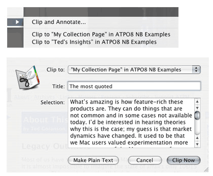
NoteBook Clipping Service Contextual Menu
That contextual menu also has an option to “clip and annotate.” In this case, a dialog appears. You type what you wish and the result pastes in the notebook page as your typed text with the clipped items as a child. This is how an outliner person thinks; just get my stuff into the outline and I’ll arrange it later.
NoteTaker’s clipping services work precisely the same way except you don’t have the option for annotation. Instead you have the option of pasting a link in the outline page that takes you to the source. Now that’s thinking from the database side and is pretty clever thinking. See what I mean about two different philosophies?
Other Observations
User Interface
Both of these notebooks have user interface quirks. Part of the problem is that they have had to reinvent stuff that other applications can take for granted. Background images don’t cover the whole background; until recently you could move NoteTaker’s title bar under the menu bar with disastrous consequence; NoteTaker’s setting for a new cell on “Return” was erratic over several months till now; there’s lots of similar stuff not worth listing.
But most of the quirks are because they have added a huge number of features without re-engineering their interface strategy. NoteTaker has a sparse preferences panel and has shoved all sorts of functionality into menus. Options, toggles, commands, and selections are mixed helter-skelter.
NoteBook has a completely different strategy. It is based on an “inspector” paradigm, the inspector pane openable from a logo in the lower right corner of pages. NoteBook offers many more options than NoteTaker and as a result has a rather confusing inspector layout. One goof is especially notable in an otherwise elegant application.
Remember that both companies are innovators in tabbed windows. Now look at one pane in NoteBook’s inspector, shown in the screenshot below. That row of icons at the top are essentially tabs, but rendered as rectangular buttons. The second row is another kind of tab, and rendered as another kind of button. And the third row of those two radio buttons? Yep, another tab using yet a third type of button. Think about this coming from one of the geniuses of the UI field and an expert in tabbed design. This is as ugly and jarring as NoteTaker’s odd outline widgets in their drawer. Both can do better and doubtless will.
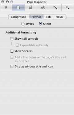
NoteBook Page Inspector
But as ugly as it is, you can muddle your way through. I think I’d rather have that than the toolbar of NoteTaker. It breaks the notebook metaphor so boldly it discomfits. Fortunately, you can easily hide it and retrieve it only when needed. Things don’t look so bad in NoteTaker if you go with the brushed metal. Their Aqua look has no soul.
NoteBook makes its own design mistake in this department. It has a huge ruler that comes and goes where NoteTaker has its toolbar. When you hide the ruler, that huge space simply becomes blank. It doesn’t shrink to allow the user as much room as possible.
Well, growing pains I suppose.
Scriptability and Encryption
NoteTaker is moving toward AppleScriptability, which puts it in a class with only OmniOutliner and now Hog Bay Notebook. Many serious outliners are also serious scripters, and usually share what they write. NoteTaker has come a long way in this regard and deserves a special acknowledgement, though it still has a way yet to go. In fairness, it has way more stuff to access than the other two.
Also, it is still not recordable, but that’s Apple’s fault. For some reason, Cocoa’s AppleScript framework doesn’t support recording, and Apple hasn’t seen fit to fix it. Please complain to Apple, as recordability is what makes scripting available to the novice.
NoteBook allows you to encrypt pages, which is to say you can protect an outline. NoteTaker allows you to password protect (much weaker protection) a notebook, in other words, protecting that database.
To Do List Capabilities
Both notebooks have capabilities to handle to do lists. Whereas they are among the best in class in outlining and databasing, their to do management—except for their strong sorting routines—is nothing to get excited about. And since they don’t exploit the outlining paradigm in this regard, I’ll just pass on making this column needlessly longer.
I do expect them to cover this base in due time. But it’s a tough nut with heavy competition.
Wrapup
So there you have it, fellow outliners. Both of these are powerhouse applications, NoteBook more from an outlining philosophy and NoteTaker more from a perspective of the freeform database. Each is world class and contender for best-in-class. Which type of thinker are you? What forms do you use when being clever?
NoteBook is $50. NoteTaker is $70. Both have 30-day demo versions.
NoteTaker requires OS X 10.2 and up, while NoteBook runs on 10.1 and up. I recommend checking them both out. Even if you did so in the past, they are different beasts now and among the most exciting things happening on the Mac.
In presenting this column, I have avoided using a review format. I have instead focused on some key features that I think will interest readers of ATPO. Naturally, I have not mentioned all features; that’s for the companies to do themselves. And I mix in my own impressions. I hope you found this column useful. If you disagree or would like to mention something I have missed, please post a comment on the ATPM site.
I’ve asked the gurus behind these programs to say a few words about the future.
Scott Love of AquaMinds Speaks to the Future
“Our product roadmap is called the SilverStar Technology Plan which we’ve been discussing with our users over the past year or so. SilverStar is the combination of specific technologies that we’re delivering along with a commitment to make sure we never lock you into a proprietary file format. Our Export NTML is the foundation for unlocking NoteTaker data and using it with other applications via plug-in XSLTs which will bridge across multiple platforms. This is why XML is so important to our current and future product plans. As such, more XSLTs will begin to appear that will transform NTML to other formats.
“Secondly, you’ll see the ability to go way beyond mere AppleScript to customize and personalize NoteTaker’s capabilities. This is the platform part of SilverStar that we’re delivering very soon. It will create a whole new way to think about using NoteTaker as a solution/application-specific environment.
“Finally, AquaMinds will deliver NoteTaker later this year on multiple platforms. OS X is still our innovation platform of choice but we’re expanding to other platforms to make NTML ubiquitous. This will mean both NoteTaker and NoteTaker Viewer versions running everywhere.”
Jayson Adams of Circus Ponies Speaks to the Future
“I believe that the only way to create truly breakthrough software is to balance your own strong design beliefs with a close relationship with your customer. That balance is the source of Circus Ponies’ strength and will continue to drive product development for many years to come. Customers keep telling us that one of the things they love about NoteBook is our company’s willingness to listen and engage them in conversation about the product—that’s just not something you can buy from other companies at any price. On our discussion forums, we have hundreds of customers talking to us and to each other about what would make them love NoteBook even more.
“I don’t want anyone to walk away with the impression that we’re foregoing certain features because we’re making NoteBook into more of an outliner than a freeform database. Cell linking, templates, and other features were in the original NoteBook when I wrote it for NeXTSTEP over 10 years ago. I left them out of NoteBook for OS X because they weren’t implemented correctly that first time out (the benefit of 10 years of hindsight). NoteTaker is a clone of the original NoteBook, and you can see these features in their original form. We chose instead to take the time to get them right—look for ‘cell linking done right,’ etc., in a future version.”
Department of Corrections, Apologies and Additions
There has been some debate here at ATPO headquarters. Some of us would like to add a feature to the column noting the updates of outliners we track with a couple sentences about what has been added or changed. We already do that for outliners that freshly appear. Would you consider that a valuable service?
Also in This Series
- A Progress Report · February 2008
- Some Perspectives on the Worldwide Developers Conference · July 2007
- Writing Environments, Plus Two New Outliners · November 2006
- Examining New Business Models · September 2006
- Outlining Interface Futures · July 2006
- Outlining Workflows and ConceptDraw · May 2006
- Dossier and Outliner Web Interaction · March 2006
- Two New Outliners: Mori and iKnow & Manage · February 2006
- Styles Revisited, Video Features, and a Proposal · December 2005
- Complete Archive
Reader Comments (17)
The notebook metaphors employed by NoteTaker and NoteBook seem terribly restrictive to me. Both implementations are very ugly too.
I think it would be extremely useful for you to mention changes to applications in the outliner zoo as they are made. The number of applications in bewildering, and a lot of them are in very active development. That would really help a lot of us.
Can I do a write-in vote for a review of finder/file-system integration? I've yet to find an application that does it to my satisfaction (i.e. completely), but have found several that almost get it (Pig Bay and SkinkHunt being the most notable). I even tried using Path Finder, hoping to press labels into duty as To Do lists, but found its failure to remember folds a show-stopper.
I'm really after an outliner/snippets manager that directly manipulates the filesystem, rather than a semi-opaque database. Although I've never used it, this sounds rather like BeOS. Perhaps one of the many applications you've mentioned so far gets sufficiently close to this already?
NoteTaker used to have a NoteTaker-format documentation file, but they seem to have moved to a PDF. They still use a NoteTaker file for information about what's new.
ADM, by the way, implements outlines of outlines, in a consistent fashion so that the same outlining commands apply throughout. (These commands, moreover, include cloning, an innovactive double hoist command, mark and gather, and a new way of mass-migrating headings.) But you aren't the only person ignoring ADM. Its developer could be another.
Thank you for the article, for me the most thought-provoking one yet.
It is true that NoteBook advertises--with less than complete candor--that it implements all of More's command set, but absent are the most memorable More commands. When I asked in the NoteBook forum whether NoteBook implements mark and gather, Jayson Adams e-mailed me to enquire about the meaning of the phrase, and when I explained, he questioned whether this functionality would be useful.
That doesn't directly speak to implementing keystroke equivalents, but I think it raises question about the depth of NoteBook's commitment to outlining. I think I disagree, consequently, that NoteBook is fundamentally an outliner (as opposed to the free form database NoteTaker). I think they are both fundamentally free form databases. And they have to be, because that's where the market is.
As freeform databases with extensive outlining support, both potentially compete with Microsoft's OneNote, whether indirectly as a competition between platforms or as future direct competitors, as with NoteTaker. They are both more mature products than OneNote, so it will be interesting how the competition shapes up.
A quibble here. That may be true of Mac outliners, but a Windows program called Automated Desktop Management 2 (ADM) has the ability to create outlines of outlines, and ADM, moreover, allows outlining operations consistently throughout. (It also has cloning, a new feature called double hoist, and mark and gather combined with new ways of reorganizing a document). In sheer power, ADM is, I think, the most powerful outliner on the planet, but you aren't the only person who is ignoring it.
A rather radical idea, actually, and I'm not sure I agree that the way a clever imagination moves depends on the philosophy behind the chosen tools. The reason I am skeptical is that there hasn't been a sea change in the thinking of users brought about by the computer revolution. Much more quantity is being produced; I don't know if the quality is better or worse; but I don't think see a change in dimensions of quality linked substantively to the methods available.
Does anyone know of a OSX app that has the abilities of infoselect (Micrologic wont write for Mac) ?
Darren
You are right about this column not addressing your needs. We expect to do a column on search strategies. But for now, there are a few Mac products to look at. However, it is not clear to me what you mean by heuristic search. I assume that means that the application watches how you use the database and intelligently anticipates your needs without you doing the work of tagging and organizing.
Nothing I know satisfies this requirement the way it should work. But take a look at DEVONthink and let us know what you, well, think about it.
Best, Ted
What you are doing is adding immeasurably to the understanding oh how we think.
I used Grandview, and loved it, then switched to InfoSelect when I moved to a PC. In both cases, their ability to gobble up disparate bits and pieces of knowledge made them indispensable. However they organized the knowledge, and found it, gave me the confidence to store it there. I stopped upgrading to new versions of InfoSelect when they became too expensive without offering enhancements that approached the simplicity of the core program.
As the editor of a monthly newspaper, I use OmniOutliner because it is neat and clean and seems to have little ambition that might make it too cumbersome. I do wish you could use keyboard shortcuts to navigate around an outline more quickly. I regularly read Ted's articles and the responses of the participants to this page (and to Outliners.com) and have come the conclusion that it's the visual form of a finished product (like a newspaper or, I guess, a Web site) that outliners are now missing. I think some of us will soon be heading off in other directions to solve the knowledge accumulation challenge. I'm glad that so many are able to articulate their thoughts and insights so clearly and provocatively.
Laurence Vittes
"Curio and Circus Ponies are toys for PowerPoint deformed kiddies."
I don't understand why anyone would use NoteTaker or NoteBook to get actual work done, no matter what workflow I try to imagine.
That said, they sure do seem to be popular, so I wonder if there are lots of stupid folks who like shiny toys out there, or if I'm just missing something.
(FWIW, I use HogBay, DEVONthink, and iCal. Plus some occassional Alepin and Microsoft Word for specific tasks.)
I use a really nice qualitative research markup tool for my interviewing work and this means that each of my notes has to be a separate rtf file. I have to work with these notes separately from everything else because I have not found a note software with Finder integration.
As Michael Williams reported, I too am trying Path finder. But that's really meant for something else and the maximum size for the preview window is rather limiting.
Add A Comment